Exploration of temporal statistics for Nationalpark Subreddits
After describing how to access the (in the meantime deprecated) Reddit API in a previous post, I took the first steps of exploring some of the temporal patterns.
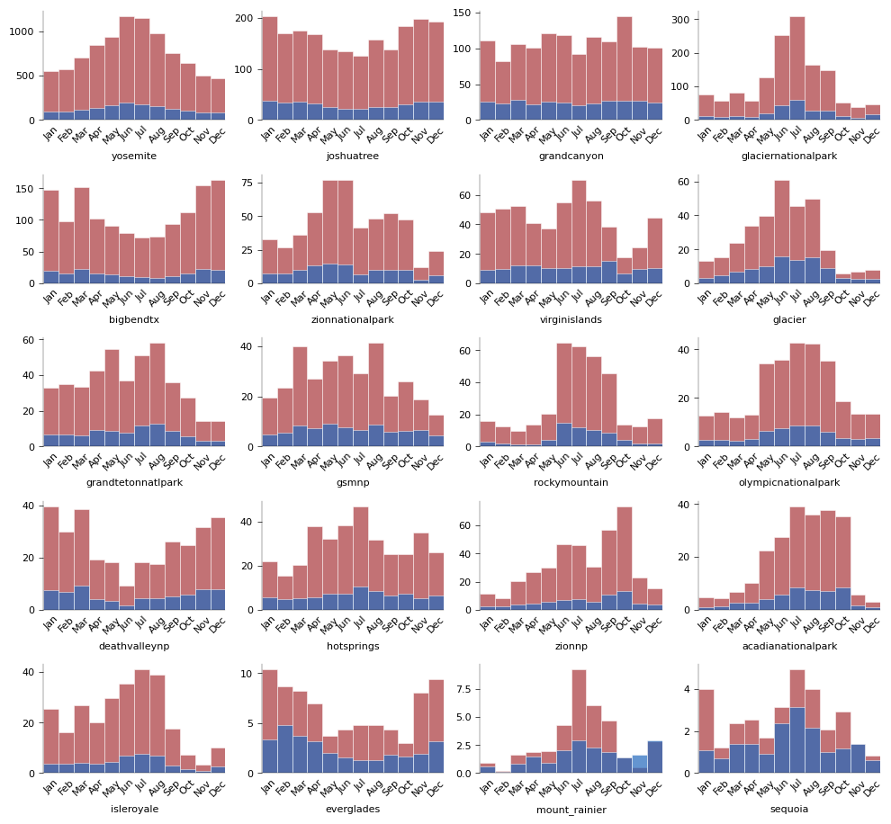
Blue are number of submissions and red are number of comments (post_count).
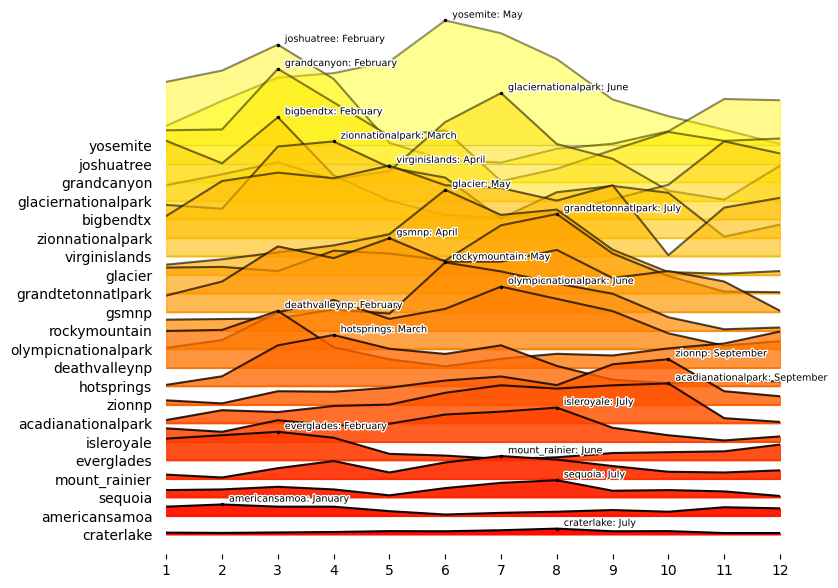
Below is a Joyplot that visualizes how individual parks’ monthly patterns diverge from the norm (the average monthly patterns for all parks), based on unique user counts.
All graphics are available in a jupyter notebook.