Extracting common areas of interest for given topics from LBSM
The task in this notebook is to extract and visualize common areas or regions of interest for a given topic from Location Based Social Media data (LBSM). On Social Media, people react to many things, and a significant share of these reactions can be seen as forms of valuation or attribution of meaning to to the physical environment. However, for visualizing such values for whole cities, there are several challenges involved:
- Identify reactions that are related to a given topic: Topics can be considered at different levels of granularity and equal terms may convey different meanings in different contexts.
- Social Media data is distributed very irregularly. Data peaks in urban areas and highly frequented tourist hotspots, while some less frequented areas do not have any data at all. When visualizing spatial reactions to topics, this inequal distribution must be taking into account, otherwise maps would always be biased towards areas with higher density of information. For this reason, normalizing results is crucial. The usual approach for normalization in such cases is that local distribution is evaluated against the global (e.g. spatial) distribution data.
For development purposes only: enable auto reload of develop dependencies, this will auto reload packages if code changes
%load_ext autoreload
%autoreload 2
#%autoreload tagmaps
Load the TagMaps package, which will serve as a base for filtering, cleaning and processing noisy social media data
from tagmaps import TagMaps
from tagmaps import EMOJI, TAGS, LOCATIONS, TOPICS
from tagmaps import LoadData
from tagmaps import BaseConfig
from tagmaps.classes.utils import Utils
1. Load Data & Overview
cfg = BaseConfig()
Initialize tag maps from BaseConfig
tm = TagMaps(
tag_cluster=cfg.cluster_tags, emoji_cluster=cfg.cluster_emoji,
location_cluster=cfg.cluster_locations,
output_folder=cfg.output_folder, remove_long_tail=cfg.remove_long_tail,
limit_bottom_user_count=cfg.limit_bottom_user_count,
max_items=cfg.max_items, topic_cluster=True)
a) Read from original data
b) Read from pre-filtered intermediate data
Read data form (already prepared) cleaned output. Cleaned output is a filtered version of original data of type UserPostLocation (UPL), which is a reference in tagmaps as 'CleanedPost'. A UPL simply has all posts of a single user at a single coordinate merged, e.g. a reduced list of terms, tags and emoji based on global occurrence (i.e. no duplicates). there're other metrics used throughout the tagmaps package, which will become handy for measuring topic reactions here:
- UPL - User post location
- UC - User count
- PC - Post count
- PTC - Total tag count ("Post Tag Count")
- PEC - Total emoji count
- UD - User days (counting distinct users per day)
- DTC - Total distinct tags
- DEC - Total distinct emoji
- DLC - Total distinct locations
tm.prepare_data(input_path='01_Input/Output_cleaned_flickr.csv')
Print stats for input data.
tm.global_stats_report()
tm.item_stats_report()
2. Topic Selection & Clustering
The next goal is to select reactions to given topics. TagMaps allows selecting posts for 4 different types:
- TAGS (i.e. single terms)
- EMOJI (i.e. single emoji)
- LOCATIONS (i.e. named POIs or coordinate pairs)
- TOPICS (i.e. list of terms)
Set basic plot to notebook mode and disable interactive plots for now
import matplotlib.pyplot as plt
#%matplotlib notebook
%matplotlib inline
import matplotlib as mpl
mpl.rcParams['savefig.dpi'] = 120
mpl.rcParams['figure.dpi'] = 120
We can retrieve preview maps for the TOPIC dimension by supplying a list of terms, for example "elbe", "fluss" and "river" should give us an overview where such terms are used in our sample area
fig = tm.get_selection_map(TOPICS,["elbe","fluss","river"])

This approach is good for terms that clearly relate to specific and named physical aspects such as the "elbe" river, which exists only once. Selecting reactions from a list of terms is more problematic for general topics such as park, nature and "green-related" activities. Have a look:
fig = tm.get_selection_map(TOPICS,["grass","nature","park"])

We can see some areas of increased coverage: the Großer Garten, some parts of the Elbe River. But also the city center, which may show a representative picture. However, there's a good chance that we catched many false-positives and false-negatives with this clear-cut selection.
Topic Vectors A better approach would be to select Topics based on "Topic-Vectors", e.g. after a list of terms is supplied, a vector is calculated that represents this topic. This topic vector can then be used to select posts that have similar vectors. Using a wide or narrow search angle, the broadness of selection can be affected. This is currently not implemented here but an important future improvement.
2a. HDBSCAN Cluster
We can visualize clusters for the selected topic using HDBSCAN. The important parameter for HDBSCAN is the cluster distance, which is chosen automatically by Tag Maps given the current scale of analysis. In the following, we manually reduce the cluster distance from 800 to 400, so we can a finer grained picture of topic clusters.
# tm.clusterer[TOPICS].autoselect_clusters = False
tm.clusterer[TOPICS].cluster_distance = 400
fig = tm.get_cluster_map(TOPICS,["grass","nature","park"])

Equally, we can get a map of clusters and cluster shapes (convex and concave hulls).
tm.clusterer[TOPICS].cluster_distance = 400
fig = tm.get_cluster_shapes_map(TOPICS,["grass","nature","park"])

Behind the scenes, Tag Maps utilizes the Single Linkage Tree from HDBSCAN to cut clusters at a specified distance. This tree shows the hierarchical structure for our topic and its spatial properties in the given area.
fig = tm.get_singlelinkagetree_preview(TOPICS,["grass", "park", "nature"])

The cluster distance can be manually set. If autoselect clusters is True, HDBSCAN will try to identify clusters based on its own algorithm.
tm.clusterer[TOPICS].cluster_distance = 400
# tm.clusterer[TOPICS].autoselect_clusters = False
2b Cluster centroids
Similarly, we can retrieve centroids of clusters. This shows again the unequal distribution of data:
fig = tm.clusterer[TOPICS].get_cluster_centroid_preview(["elbe","fluss","river"])

To get only the important clusters, we can drop all single cluster items:
# tm.clusterer[TOPICS].get_cluster_centroid_preview(["elbe", "fluss", "river"])
fig = tm.clusterer[TOPICS].get_cluster_centroid_preview(["elbe","fluss","river"], single_clusters=False)

3a. Datashader
# census example http://datashader.org/topics/census.html
# https://github.com/pyviz/datashader/issues/590
# http://datashader.org/topics/bay_trimesh.html
# https://github.com/pyviz/datashader/issues/582
# http://holoviews.org/reference/elements/bokeh/TriMesh.html
# Possible solution.
#
# 1. Create the canvas with the size (per pixel) desired.
# 2. use datashader aggreate, flipud
# 3. use rasterio to create the geotiff.
import pandas as pd
import datashader as ds
import datashader.transfer_functions as tf
import dask.dataframe as dd
import numpy as np
from datashader.utils import lnglat_to_meters
background = "black"
from functools import partial
from datashader.utils import export_image
from datashader.colors import colormap_select, Greys9
from IPython.core.display import HTML, display
background = "black"
export = partial(export_image, background = background, export_path="export")
cm = partial(colormap_select, reverse=(background!="black"))
display(HTML("<style>.container { width:100% !important; }</style>"))
Select points
topic = "grass-nature-park"
points = tm.clusterer[TOPICS].get_np_points(
item=topic,
silent=True)
all_points = tm.clusterer[TOPICS].get_np_points()
project data to auto detected UTM Zone from TagMaps
import pyproj
# project lat/lng to UTM 33N (Dresden)
crs_wgs = tm.clusterer[TOPICS].crs_wgs
crs_proj = tm.clusterer[TOPICS].crs_proj
all_points = np.array([pyproj.transform(crs_wgs, crs_proj, point[0], point[1]) for point in all_points])
df = pd.DataFrame(data=all_points)
df.columns = ['longitude', 'latitude']
df.head()
# set plotting bounds (Dresden)
right = df.longitude.max()
left = df.longitude.min()
top = df.latitude.max()
bottom = df.latitude.min()
x_range, y_range = ((left,right), (bottom, top))
x_dist = x_range[1]-x_range[0]
y_dist = y_range[1]-y_range[0]
ratio = x_dist/y_dist
print(ratio)
plot_width = int(750)
plot_height = int(plot_width//ratio)
%%time
from colorcet import fire
cvs = ds.Canvas(plot_width=plot_width, plot_height=plot_height, x_range=x_range, y_range=y_range)
agg = cvs.points(df, 'longitude', 'latitude')
#img = tf.shade(agg)
#img = export(tf.shade(agg, cmap = cm(Greys9,0.2), how='eq_hist'), "census_gray_eq_hist")
#img = export(tf.shade(ds.Canvas().raster(agg, interpolate='nearest'), name="nearest-neighbor interpolation"))
img = export(tf.shade(agg, cmap = cm(fire,0.2), how='eq_hist'),"census_ds_fire_eq_hist")
img

Interactive DS Image:
import holoviews as hv
import datashader as ds
from holoviews.operation.datashader import aggregate, datashade
from datashader.bokeh_ext import InteractiveImage
import bokeh.plotting as bp
def image_callback(x_range, y_range, w, h, name=None):
cvs = ds.Canvas(plot_width=plot_width, plot_height=plot_height, x_range=x_range, y_range=y_range)
agg = cvs.points(df, 'longitude', 'latitude')
img = tf.shade(agg, cmap = cm(fire,0.2), how='eq_hist')
return export(tf.shade(agg, cmap = cm(fire,0.2), how='eq_hist'),"census_ds_fire_eq_hist")
bp.output_notebook()
p = bp.figure(tools='pan,wheel_zoom,reset', x_range=x_range, y_range=y_range, plot_width=plot_width, plot_height=plot_height)
InteractiveImage(p, image_callback)
3c. IDW Interpolation (Raster)
IDW (inverse distance weighting) has been tested andfound not suitable. It is shown here for reasons of comparison (to KDE/HDBSCAN). To summarize the IDW approach:
- use clustered centroids from HDBSCAN
- inverse interpolate usercounts per cluster to rasterimport param
import panel as pn
import holoviews as hv
import numpy as np
import xmsinterp as interp
import pandas as pd
import xarray as xr
import hvplot.pandas
import math
import hvplot.xarray
from holoviews.streams import Params
Get data from TagMaps
tm.clusterer[TOPICS].cluster_distance = 400
points, usercount = tm.clusterer[TOPICS].get_cluster_centroid_data(
["grass","park","garden"], projected=True, single_clusters=False)
# from datashader.utils import lnglat_to_meters as webm
df = pd.DataFrame(data=points)
df['usercount'] = usercount
# df = pd.DataFrame(data=points)
df.columns = ['longitude', 'latitude', 'usercount']
# coordinates in web mercator
# df.loc[:, 'longitude'], df.loc[:, 'latitude'] = webm(df.longitude,df.latitude)
# df.loc[:, 'longitude'], df.loc[:, 'latitude'] = lnglat_to_meters(df.longitude,df.latitude)
# reduce size of largest clusters
df['usercount'] = df['usercount'].apply(lambda x: math.sqrt(x))
#df.loc[:, 'usercount'] = math.sqrt(df.usercount).tolist()
df.head()
Rename columns and reverse order for plotting
#points = tm.clusterer[TOPICS]._get_np_points(
# item=["green", "nature", "park"],
# silent=True)
# df = pd.DataFrame(data=points, columns=["longitude", "latitude"])
# to study number of overlapping coordinates:
# df = df.groupby(["x", "y"]).size().to_frame('c').reset_index()
# to study number of users per cluster:
df = df.rename(columns={'longitude': 'x', 'latitude': 'y', 'usercount': 'c'})
# reverse order so that top points appear first on the plot
df = df.iloc[::-1]
df.head()
Visualize in hvplot
# plot preview in matplotlib
df.hvplot.scatter(x='x', y='y', c='c', height=480, width=800, cmap='jet', size=120, colorbar=True)

Visualize in Geoviews
import xarray as xr
import numpy as np
import pandas as pd
import holoviews as hv
import geoviews as gv
import geoviews.feature as gf
import cartopy
from cartopy import crs as ccrs
import geoviews.tile_sources as gts
hv.notebook_extension('bokeh')


df.head()
#user_count = gv.Dataset(df)
user_count = hv.Dataset(df)
from tagmaps.classes.utils import Utils
bounds = Utils.get_rectangle_bounds(points)
#bounds = tm.clusterer[TAGS].bounds
#%%opts Overlay [width=600 height=300]
#%%opts [tools=['save', 'pan', 'wheel_zoom', 'box_zoom', 'reset'] size_index=2 color_index=2 xaxis=None yaxis=None]
points = gv.Points(user_count, kdims=['x', 'y'],
vdims=['c'], extents=(bounds.lim_lng_min, bounds.lim_lat_min, bounds.lim_lng_max, bounds.lim_lat_max),
crs=ccrs.UTM(zone='33N'))
gv.tile_sources.CartoLight.opts(width=800, height=480) *\
points.opts(size=6, width=800, height=480, cmap='viridis', tools=['save', 'pan', 'wheel_zoom', 'box_zoom', 'reset'], size_index=2, color_index=2)
Generate grid for visualization
Get the min, max (x, y) of the data and generate a grid of points.
# get the (x,y) range of the data and expand by 10%
def buffer_range(range_min, range_max, buf_by=0.1):
buf = (range_max - range_min) * buf_by
return (range_min - buf, range_max + buf)
x_range = buffer_range(df.x.min(), df.x.max())
y_range = buffer_range(df.y.min(), df.y.max())
# adjust these values for a higher/lower resolution grid
number_of_x_points=480
number_of_y_points=800
x = np.linspace(x_range[0], x_range[1], number_of_x_points)
y = np.linspace(y_range[0], y_range[1], number_of_y_points)
grid = np.meshgrid(x, y)
pts = np.stack([i.flatten() for i in grid], axis=1)
pts
Interpolate to the grid using linear interpolation and display the results with matplotlib.
linear = interp.interpolate.InterpLinear(df.values)
z = linear.interp_to_pts(pts)
# I would prefer to be able to set up an interpolator like this:
# linear = interp.Interpolator(kind='linear', values=df.values)
zz = np.reshape(z, (len(y), len(x)))
xa = xr.DataArray(coords={'x': x, 'y': y}, dims=['x', 'y'], data=zz.T)
xa.hvplot(x='x', y='y', height=480, width=800, cmap='viridis')

Interpolate using natural neighbor. The first example shows a "constant" nodal function and the second example shows a "quadratic" nodals function. A nodal function can better model trends that exist in the measured values.
linear.set_use_natural_neighbor()
z = linear.interp_to_pts(pts)
# z = linear.interp_to_pts(pts, use='natural_neighbor')
zz = np.reshape(z, (len(y), len(x)))
xa = xr.DataArray(coords={'x': x, 'y': y}, dims=['x', 'y'], data=zz.T)
xa.hvplot(x='x', y='y', height=480, width=800, cmap='viridis')

Now do natural neighbor with a quadratic nodal function.
linear.set_use_natural_neighbor(nodal_func_type="quadratic", nd_func_pt_search_opt="nearest_pts")
z = linear.interp_to_pts(pts)
# z = linear.interp_to_pts(pts, use='natural_neighbor', nodal_func_type='quadratic', nd_func_pt_search_opt='nearest_pts')
zz = np.reshape(z, (len(y), len(x)))
xa = xr.DataArray(coords={'x': x, 'y': y}, dims=['x', 'y'], data=zz.T)
xa.hvplot(x='x', y='y', height=480, width=800, cmap='viridis')
Now we will use Inverse Distance Weighted (IDW) to interpolate to the grid. Notice that unlike Linear and Natural Neighbor interpolation, IDW interpolation can extrapolate beyond the bounds of the input data points.
idw = interp.interpolate.InterpIdw(df.values)
z = idw.interp_to_pts(pts)
# idw = interp.Interpolator(kind='idw', values=df.values)
# z = idw.interp_to_pts(pts)
zz = np.reshape(z, (len(y), len(x)))
xa = xr.DataArray(coords={'x': x, 'y': y}, dims=['x', 'y'], data=zz.T)
xa.hvplot(x='x', y='y', height=480, width=800, cmap='viridis')

Now interpolate using a nodal function to try to better capture trends in the data set.
idw.set_nodal_function(nodal_func_type="gradient_plane")
z = idw.interp_to_pts(pts)
# z = idw.interp_to_pts(pts, nodal_func_type='gradient_plane')
zz = np.reshape(z, (len(y), len(x)))
xa = xr.DataArray(coords={'x': x, 'y': y}, dims=['x', 'y'], data=zz.T)
xa.hvplot(x='x', y='y', height=480, width=800, cmap='viridis')

Notice, in the previous interpolation that we get negative values in some locations. If we assume that there should be no negatives values (like when measuring concentration) we can use the truncation options to adjust the interpolation.
idw.set_truncation_max_min(smax=20, smin=0)
z = idw.interp_to_pts(pts)
# z = idw.interp_to_pts(pts, smax=150, smin=0)
zz = np.reshape(z, (len(y), len(x)))
xa = xr.DataArray(coords={'x': x, 'y': y}, dims=['x', 'y'], data=zz.T)
xa.hvplot(x='x', y='y', height=480, width=800, cmap='viridis', alpha=0.5)
Overlay Raster in Geoviews
gv.tile_sources.CartoLight.opts(width=800, height=480) * xa.hvplot(x='x', y='y', height=480, width=800, cmap='viridis', alpha=0.5, crs=ccrs.UTM(zone='33N'))

4. Kernel Density Estimation (KDE)
For KDE, we do not need clustered data. The number of distinct User post Locations (UPL) is fine for computing a kde-based heatmap.
There's some helpful information here:
https://scikit-learn.org/stable/auto_examples/neighbors/plot_species_kde.html#sphx-glr-auto-examples-neighbors-plot-species-kde-py
https://gawron.sdsu.edu/python_for_ss/course_core/book_draft/visualization/visualizing_geographic_data.html
https://jakevdp.github.io/PythonDataScienceHandbook/05.13-kernel-density-estimation.html
Also see this note regarding KDE with adaptive bandwidth:
https://stackoverflow.com/questions/31483625/adaptive-bandwidth-kernel-density-estimation
import numpy as np
import pandas as pd
import matplotlib.pyplot as plt
from sklearn.neighbors.kde import KernelDensity
a) Get Topic Coordinates
The distribution of these coordinates is what we want to visualize.
topic = "grass-nature-park"
points = tm.clusterer[TOPICS].get_np_points(
item=topic,
silent=True)
b) Get All Points
This will be used to normalize our selection.
all_points = tm.clusterer[TOPICS].get_np_points()
For normalizing our final KDE raster, we'll process both, topic selection points and global data distribution (e.g. all points in the dataset).
points_list = [points, all_points]
The input data is a simply list (er.. numpy.ndarray) of decimal degree coordinates,
each entry represents a single user that published one or more posts at a specific coordinate:
print(points[:5])
print(f'Total coordinates: {len(points)}')
Optional filter points on box: Großer Garten
def lies_within(x, y):
# optional filtering for bounding box
if (lim_lng_min < x < lim_lng_max) and (lim_lat_min < y < lim_lat_max):
return True
lim_lng_max = 13.7881851196289
lim_lng_min = 13.7279319763184
lim_lat_max = 51.051862274016
lim_lat_min = 51.0257408831289
# list comprehension
for idx, points in enumerate(points_list):
points_list[idx] = np.array([[point[0], point[1]] for point in points if lies_within(point[0], point[1])])
print(f'Total coordinates after filtering: {len(points_list[0])} (selected Topic) {len(points_list[1])} (all)')
For faster KDE, we project data from WGS1984 (epsg:4326) to UTM - this allows us to directly calculate in euclidian space.
The TagMaps package automatically detected the most suitable UTM coordinate system,
which is Zone 33N (epsg:32633) for Dresden:
import pyproj
# project lat/lng to UTM 33N (Dresden)
crs_wgs = tm.clusterer[TOPICS].crs_wgs
crs_proj = tm.clusterer[TOPICS].crs_proj
for idx, points in enumerate(points_list):
points_list[idx] = np.array([pyproj.transform(crs_wgs, crs_proj, point[0], point[1]) for point in points])
print(f'From {crs_wgs} \nto {crs_proj}')
print(points_list[0][:5])
Calculating the Kernel Density
To summarize sklearn, a KDE is executed in two steps, training and testing:
Machine learning is about learning some properties of a data set and then testing those properties against another data set. A common practice in machine learning is to evaluate an algorithm by splitting a data set into two. We call one of those sets the training set, on which we learn some properties; we call the other set the testing set, on which we test the learned properties.
The only attributes we care about in training are lat and long.
- Stack locations using np.vstack, extract specific columns with [:,column_id]
- reverse order: lat, lng
- Transpose to Rows (.T), easier in python ref
xy_list = list()
for points in points_list:
y = points[:,1]
x = points[:,0]
xy_list.append([x, y])
xy_train_list = list()
for x, y in xy_list:
xy_train = np.vstack([y, x]).T
xy_train_list.append(xy_train)
print(xy_train)
Get bounds from total data
# access min/max decimal degree bounds object of clusterer and project to UTM33N
#lim_lng_max = tm.clusterer[TAGS].bounds.lim_lng_max
#lim_lng_min = tm.clusterer[TAGS].bounds.lim_lng_min
#lim_lat_max = tm.clusterer[TAGS].bounds.lim_lat_max
#lim_lat_min = tm.clusterer[TAGS].bounds.lim_lat_min
# project WDS1984 to UTM
topright = pyproj.transform(crs_wgs, crs_proj, lim_lng_max, lim_lat_max)
bottomleft = pyproj.transform(crs_wgs, crs_proj, lim_lng_min, lim_lat_min)
# get separate min/max for x/y
right_bound = topright[0]
left_bound = bottomleft[0]
top_bound = topright[1]
bottom_bound = bottomleft[1]
Create Sample Mesh: Create a grid of points at which to predict.
https://github.com/epierson9/densityMapping/blob/master/plotDensity.py
(grid of sample locations with default: 100x100 bins=pixels)
xbins=100j
ybins=100j
xx, yy = np.mgrid[left_bound:right_bound:xbins,
bottom_bound:top_bound:ybins]
xy_sample = np.vstack([yy.ravel(), xx.ravel()]).T
Generate Training data for Kernel Density.
The largest effect on the final result comes from the chosen bandwidth for KDE - smaller bandwidth mean higher resultion,
but may not be suitable for the given density of data (e.g. results with low validity).
Higher bandwidth will produce a smoother raster result, which may be too inaccurate for interpretation.
Compare:
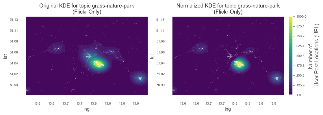
- bandwidth=800: generalized popular "green" areas - e.g. Grosser Garten, Schoner Grund, Pillnitz, Elbschlösser
- bandwidth=200: Details within Grosser Garten still visible
kde_list = list()
for xy_train in xy_train_list:
kde = KernelDensity(kernel='gaussian', bandwidth=200, algorithm='ball_tree')
kde.fit(xy_train)
kde_list.append(kde)
score_samples() returns the log-likelihood of the samples
z_list = list()
for kde in kde_list:
z_scores = kde.score_samples(xy_sample)
z = np.exp(z_scores)
z_list.append(z)
Normalize z-scores to 1 to 1000 range for comparison
for idx, z in enumerate(z_list):
z_list[idx] = np.interp(z, (z.min(), z.max()), (1, 1000))
Subtact global zscores from local z-scores (our topic selection)
z_orig = z_list[0]
z_is = z_list[0] - z_list[1]
z_results = [z_orig, z_is]
Remove values below zero,
these are locations where selected topic is underrepresented, given the global KDE mean
z_results[1] = z_results[1].clip(min=0)
#z_results[1] = np.interp(z_results[1], (z_results[1].min(), z_results[1].max()), (1, 1000))
Reshape results to fit grid mesh extent
for idx, z_result in enumerate(z_results):
z_results[idx] = z_results[idx].reshape(xx.shape)
Plot original and normalized meshes
from matplotlib.ticker import FuncFormatter
def y_formatter(y_value, __):
"""Format UTM to decimal degrees y-labels for improved legibility"""
xy_value = pyproj.transform(crs_proj, crs_wgs, left_bound, y_value)
return f'{xy_value[1]:3.2f}'
def x_formatter(x_value, __):
"""Format UTM to decimal degrees x-labels for improved legibility"""
xy_value = pyproj.transform(crs_proj, crs_wgs, x_value, bottom_bound)
return f'{xy_value[0]:3.1f}'
# a figure with a 1x2 grid of Axes
fig, ax_lst = plt.subplots(1, 2,figsize=(10, 3))
for idx, zz in enumerate(z_results):
# create matplotlib figure for object oriented mode
#fig = plt.figure(1)
#fig.add_subplot(111)
axis = ax_lst[idx]
# Change the fontsize of minor ticks label
axis.tick_params(axis='both', which='major', labelsize=7)
axis.tick_params(axis='both', which='minor', labelsize=7)
# set plotting bounds
axis.set_xlim(
[left_bound, right_bound])
axis.set_ylim(
[bottom_bound, top_bound])
# plot contours of the density
levels = np.linspace(zz.min(), zz.max(), 25)
# axis.pcolormesh(xx, yy, zz, cmap='viridis')
# Create Contours,
# save to CF-variable so we can later reference
# it in colorbar hook
CF = axis.contourf(xx, yy, zz, levels=levels, cmap='viridis')
# titles for plots
if idx == 0:
title = f'Original KDE for topic {topic}\n(Flickr Only)'
else:
title = f'Normalized KDE for topic {topic}\n(Flickr Only)'
axis.set_title(title, fontsize=11)
axis.set_xlabel('lng', fontsize=10)
axis.set_ylabel('lat', fontsize=10)
# plot points on top
axis.scatter(xy_list[1][0], xy_list[1][1], s=1, facecolor='white', alpha=0.05)
axis.scatter(xy_list[0][0], xy_list[0][1], s=1, facecolor='white', alpha=0.1)
#cbar.set_ticks([])
# replace x, y coords with decimal degrees text (instead of UTM dist)
axis.yaxis.set_major_formatter(FuncFormatter(y_formatter))
axis.xaxis.set_major_formatter(FuncFormatter(x_formatter))
if idx > 0:
break
# Make a colorbar for the ContourSet returned by the contourf call.
cbar = fig.colorbar(CF,fraction=0.046, pad=0.04)
cbar.set_title = ""
cbar.sup_title = ""
cbar.ax.set_ylabel("Number of \n User Post Locations (UPL)", fontsize=11)
cbar.ax.set_title('')
#cbar.ax.set_ylabel()
cbar.ax.tick_params(axis='both', labelsize=7)
cbar.ax.yaxis.set_tick_params(width=0.5, length=4)
for axe in ax_lst:
axe.plot()
plt.show()

This is the Dresden wide map (comparison between original and normalized KDE). We can clearly see that the city centre is not included in the normalized map. For the sub-area of the Großer Gartenn (above), normalization has almost no effect, because gree-related topic peaks in this area anyway.
5. Combine HDBSCAN and KDE
For the final map, we want to combine the different data we collected. This means adding cluster shapes from HDBSCAN and generating a standalone interactive and external html for sharing.
from descartes import PolygonPatch
def get_poly_patch(polygon):
"""Returns a matplotlib polygon-patch from shapely polygon"""
patch = PolygonPatch(polygon, fc='#000000',
ec='#999999', fill=False,
zorder=1, alpha=0.7)
return patch
# a figure with a 1x1 grid of Axes
fig, axis = plt.subplots(1)
# create matplotlib figure for object oriented mode
#fig = plt.figure(1)
#fig.add_subplot(111)
# Change the fontsize of minor ticks label
axis.tick_params(axis='both', which='major', labelsize=7)
axis.tick_params(axis='both', which='minor', labelsize=7)
# set plotting bounds
axis.set_xlim(
[left_bound, right_bound])
axis.set_ylim(
[bottom_bound, top_bound])
# plot contours of the density
levels = np.linspace(zz.min(), zz.max(), 25)
# axis.pcolormesh(xx, yy, zz, cmap='viridis')
CF = axis.contourf(xx, yy, zz, levels=levels, cmap='viridis')
#CS2 = plt.contourf(xx, yy, zz, levels=levels, cmap='viridis')
title = f'Normalized KDE for topic {topic} \n with HDBSCAN Cluster Shapes added \n(Flickr Only)'
axis.set_title(title)
axis.set_xlabel('lng', fontsize=10)
axis.set_ylabel('lat', fontsize=10)
# plot points on top
axis.scatter(xy_list[0][0], xy_list[0][1], s=1, facecolor='white', alpha=0.1)
#cbar.set_ticks([])
# replace x, y coords with decimal degrees text (instead of UTM dist)
axis.yaxis.set_major_formatter(FuncFormatter(y_formatter))
axis.xaxis.set_major_formatter(FuncFormatter(x_formatter))
# Make a colorbar for the ContourSet returned by the contourf call.
cbar = fig.colorbar(CF, label='Number of \n User Post Locations (UPL)',fraction=0.046, pad=0.04)
cbar.set_title = ""
cbar.sup_title = ""
cbar.ax.set_title('')
#cbar.ax.set_ylabel()
cbar.ax.tick_params(axis='both', labelsize=7)
cbar.ax.yaxis.set_tick_params(width=0.5, length=4)
# Get Cluster Shapes from TagMaps
tm.clusterer[TOPICS].cluster_distance = 200
result = tm.clusterer[TOPICS].cluster_item(
item=topic,
preview_mode=True)
clusters = result[0]
selected_post_guids = result[1]
points = result[2]
sel_colors = result[3]
mask_noisy = result[4]
number_of_clusters = result[5]
# cluster_guids: those guids that are clustered
tm.clusterer[TOPICS].cluster_distance = 400
cluster_guids, _ = tm.clusterer[TOPICS]._get_cluster_guids(
clusters, selected_post_guids)
shapes, _ = tm.clusterer[TOPICS]._get_item_clustershapes(topic, cluster_guids)
# create main cluster points map
for shape in shapes:
patch = get_poly_patch(shape[0])
axis.add_patch(patch)
#axis.plot()
#plt.show()

6. Overlay Raster in Geoviews for interactive display
import numpy as np
import pandas as pd
import holoviews as hv
import geoviews as gv
import geoviews.feature as gf
import hvplot.pandas
import hvplot.xarray
from cartopy import crs as ccrs
import geoviews.tile_sources as gts
hv.notebook_extension('bokeh')
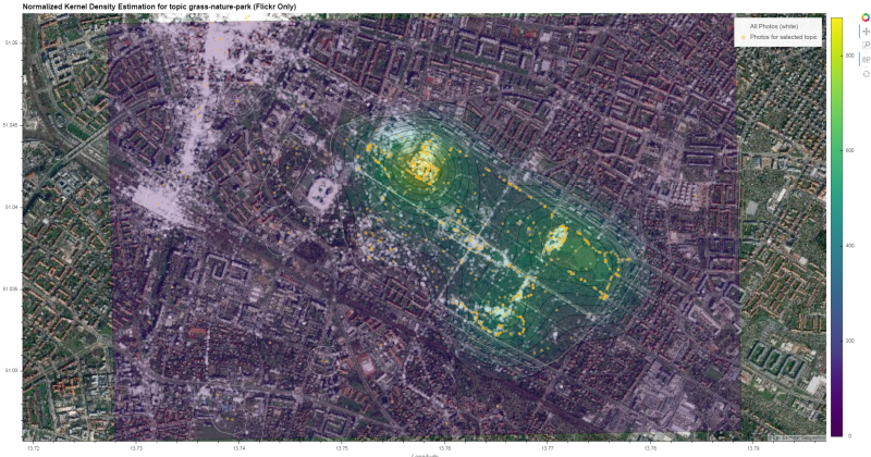
Display map and Overlay raster
contours = gv.FilledContours((xx.T, yy.T, zz.T), vdims='Number of \n User Post Locations (UPL)', crs=ccrs.UTM(zone='33N'))
Create additional layer for HDBSCAN cluster shapes
import geoviews.feature as gf
gv_shapes = gv.Polygons(
[shape[0] for shape in shapes], label=f'HDBSCAN city-wide Cluster Shapes for topic', crs=ccrs.UTM(zone='33N'))
Compile final output. Have a look at the generated interactive html here
%%output filename="meingruen_freq_gg"
%%opts Overlay [title_format="Normalized Kernel Density Estimation for topic {topic} (Flickr Only)"]
#Bokeh [x_range=Range1d(left_bound, right_bound), y_range=Range1d(bottom_bound, top_bound)]
from bokeh.models import Range1d
# output to file
# for 100% stretch,
# need to modify output file: change '<div style=' to 'width: 100%; height: 100%; margin: 0 auto;'
def set_active_tool(plot, element):
# enable wheel_zoom by default
plot.state.toolbar.active_scroll = plot.state.tools[0]
# the Overlay will automatically extent to data dimensions,
# the polygons of HDBSCAN cover the city area:
# since we want the initial zoom to be zoomed in to the Großer Garten
# we need to supply xlim and ylim
# The Bokeh renderer only support Web Mercator Projection
# we therefore need to project Großer Garten Bounds first
# from WGS1984 to Web Mercator
gg_bottomleft = pyproj.transform(pyproj.Proj(init='EPSG:4326'), pyproj.Proj(init='EPSG:3857'), lim_lng_min, lim_lat_min)
gg_topright = pyproj.transform(pyproj.Proj(init='EPSG:4326'), pyproj.Proj(init='EPSG:3857'), lim_lng_max, lim_lat_max)
# construct final overlay from individual layers
# 1. Backgorund Tiles (sattelite)
# 2. All Points (Photos)
# 3. KDE Contours
# 4. Selected topic points ('green' photos)
# 5. HDBSCAN Cluster Shapes
hv.Overlay(
gv.tile_sources.EsriImagery * \
gv.Points((xy_list[1][0], xy_list[1][1]), label='All Photos (white)', crs=ccrs.UTM(zone='33N')).opts(size=5, color='white', alpha=0.3) * \
contours.opts(colorbar=True, cmap='viridis', alpha=0.3, clipping_colors={'NaN': (0, 0, 0, 0)}) * \
gv.Points((xy_list[0][0], xy_list[0][1]), label=f'Photos for selected topic', crs=ccrs.UTM(zone='33N')).opts(size=5, color='orange', alpha=0.3) * \
gv_shapes.opts(line_color='white', line_width=0.5, fill_alpha=0)
).opts(
sizing_mode='stretch_both',
finalize_hooks=[set_active_tool],
xlim=(gg_bottomleft[0],gg_topright[0]),
ylim=(gg_bottomleft[1],gg_topright[1])
)
There're other approaches not tested in this notebook:
Holoviews Bivariate
http://holoviews.org/reference/elements/matplotlib/Bivariate.html
Cartopy KDE https://github.com/williamjameshandley/spherical_kde
Scipy Kernel Density e.g.
from scipy import stats
sgkde = stats.gaussian_kde(df, bw_method='scott', weights='usercount')