A conceptual framework for studying reactions to events in location-based social media
Overview of paper progress and conducted analyses
1) Timeline
- 2017-02-02: Dresden Meeting, first structure of paper
2017-02-02_Abstract_evavgi.docx
Abstract Submission long
Abstract Submission short - 2017-03-07: Stuttgart Meeting, first draft of paper
2017-03-07_Abstract_evavgi_V17.docx - 2017-05-30: Send to co-authors: Revised draft with examples & analyses
? - 2017-06-24: Start incoorporating Comments from E. Hauthal, D. Burghardt, R. Purves, G. & N. Andrienko
? - 2017-07-15: Paper submission for SI “Representation and Analytical Models for Location-based Social Media Data and Tracking Data” (IJGIS)
?
2) Analyses
a) St. Jude
Starting point: Storm-related Flickr images 2007 - 2017 filtered for the following labels in tags or descriptions: storm OR cyclone OR gale OR gust OR hurricane OR blow OR wind OR windy OR orkan ..compared to the overall number of available Flickr images per day for the timespan October-20 to November-10. (21 days)
1) Area: Europe; Timespan: xxxx-10-20 to xxxx-11-10 (21 days)
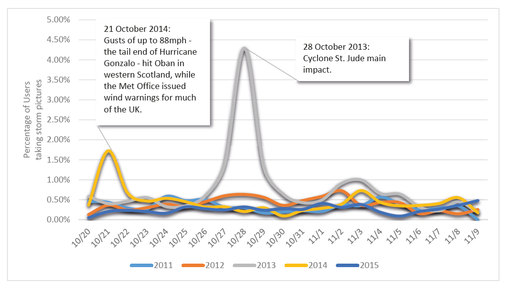
- On St. Jude day of peak impact (Oct-28), almost 5% of all active Flickr users took storm-related pictures
2) Area: UKCoast (10km buffer), UK, France; Timespan: 2013-10-20 to 2013-11-10 (21 days)
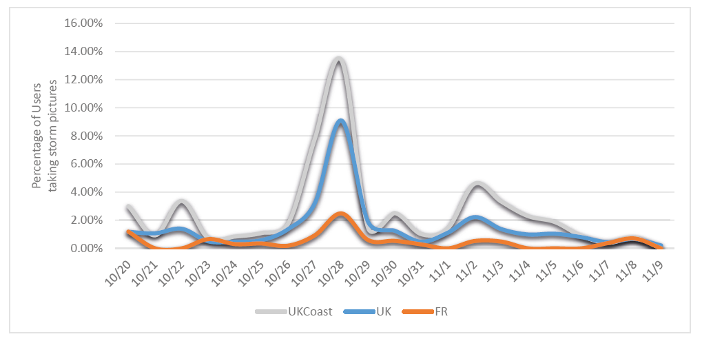
- Spatial filtering increases percentages: most storm-related pictures taken on coasts (+ earlier reactions)
- possible bias for non-english speaking countries (France)
Data Statistics Flickr (Europe):
- storm OR cyclone OR gale (xxxx-10-20 to xxxx-11-10 - 21 days):
| 2011 | 2012 | 2013 | 2014 | 2015 | |
|---|---|---|---|---|---|
| photos | 272 | 339 | 1036 | 237 | 96 |
| users | 108 | 184 | 362 | 145 | 68 |
| tags | 3917 | 4574 | 14042 | 3704 | 1653 |
| unique tags | 1094 | 1766 | 4381 | 1437 | 837 |
- gust OR hurricane OR blow (xxxx-10-20 to xxxx-11-10 - 21 days):
| 2011 | 2012 | 2013: | 2014: | 2015: | |
|---|---|---|---|---|---|
| photos | 63 | 41 | 49 | 65 | 12 |
| users | 10 | 19 | 27 | 20 | 11 |
| tags | 1091 | 506 | 792 | 768 | 141 |
| unique tags | 133 | 281 | 426 | 220 | 134 |
- wind OR windy OR orkan (xxxx-10-20 to xxxx-11-10 - 21 days):
| 2011 | 2012 | 2013: | 2014: | 2015: | |
|---|---|---|---|---|---|
| photos | 441 | 454 | 526 | 319 | 240 |
| users | 104 | 143 | 221 | 143 | 88 |
| tags | 6817 | 8381 | 10778 | 5771 | 4214 |
| unique tags | 1331 | 1954 | 3216 | 1517 | 1352 |
b) Brexit
Eva-Brexit-Analysis
TwitterBrexitReaktionen_Eva.pdf
Alex-Brexit-Analysis:
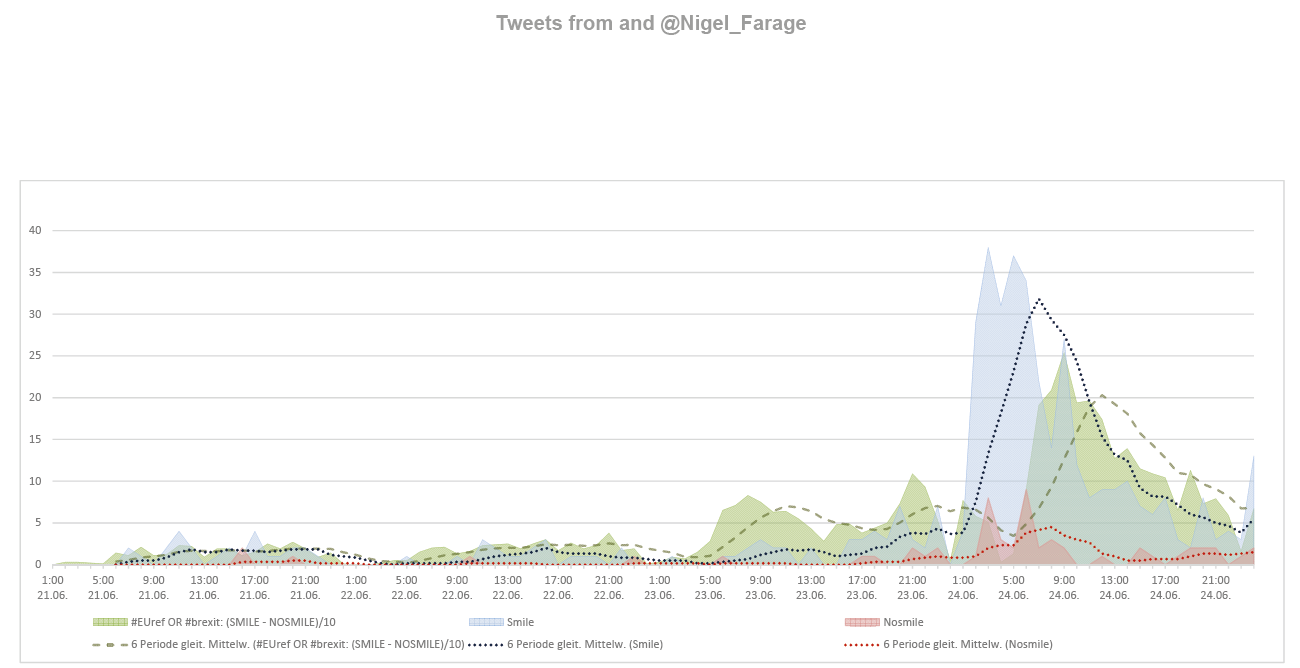
1a) Tweets from and @Nigel_Farage; Timespan: Thu 23 18:00 to Fri 24 9:50
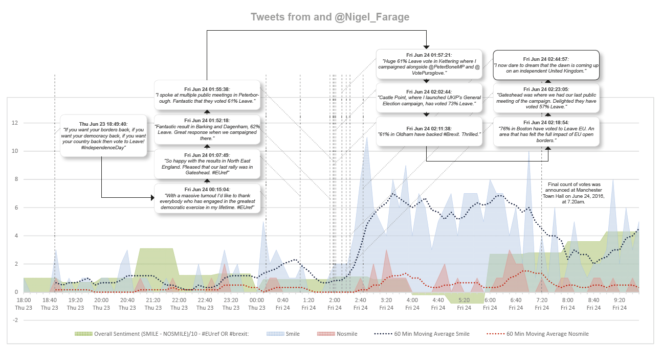
- Overall Sentiment is calculated based on all tweets with the Hashtag #EUref or
#Brexit containing a clear negative or positive ‘sentiment’, based on Twitter’s
advanced search (i.e. positive tweets will turn up posts including a range of common
smilies, indicating the overall tone of the tweet was positive. Looking for negative
tweets conversely fi nds tweets featuring a range of frowns).
From 06/23/2016 18:00 to 06/24/2016 9:50, for hashtags #EUref or #Brexit, there
were 4042 tweets with positive sentiment (smile) and 2580 tweets with negative
sentiment (nosmile).
- Smile (blue) and Nosmile (red) was calculated based on all tweets that
are directed @Nigel_Farage with a clear expression of sentiment.
From 06/23/2016 18:00 to 06/24/2016 9:50, this data encompasses 275
positive tweets and 38 negative tweets (ratio = 7.23).
Tweets from Nigel_Farage are attached in chronological order to the
chart above
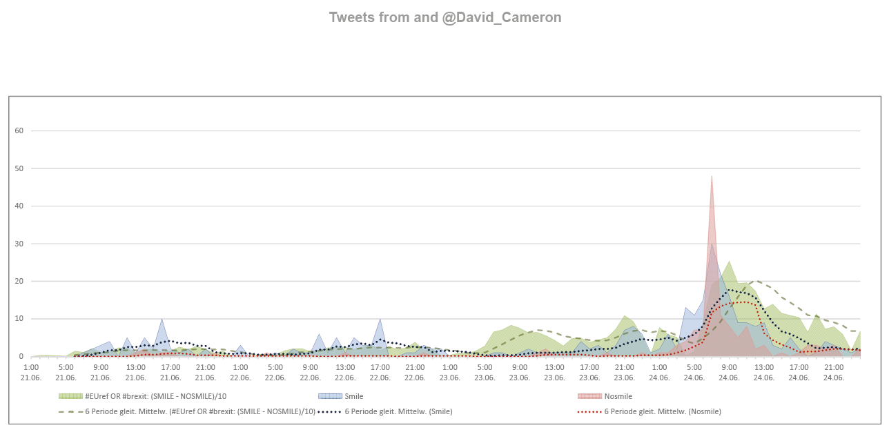
1b) Tweets from and @David_Cameron; Timespan: Thu 23 18:00 to Fri 24 9:50
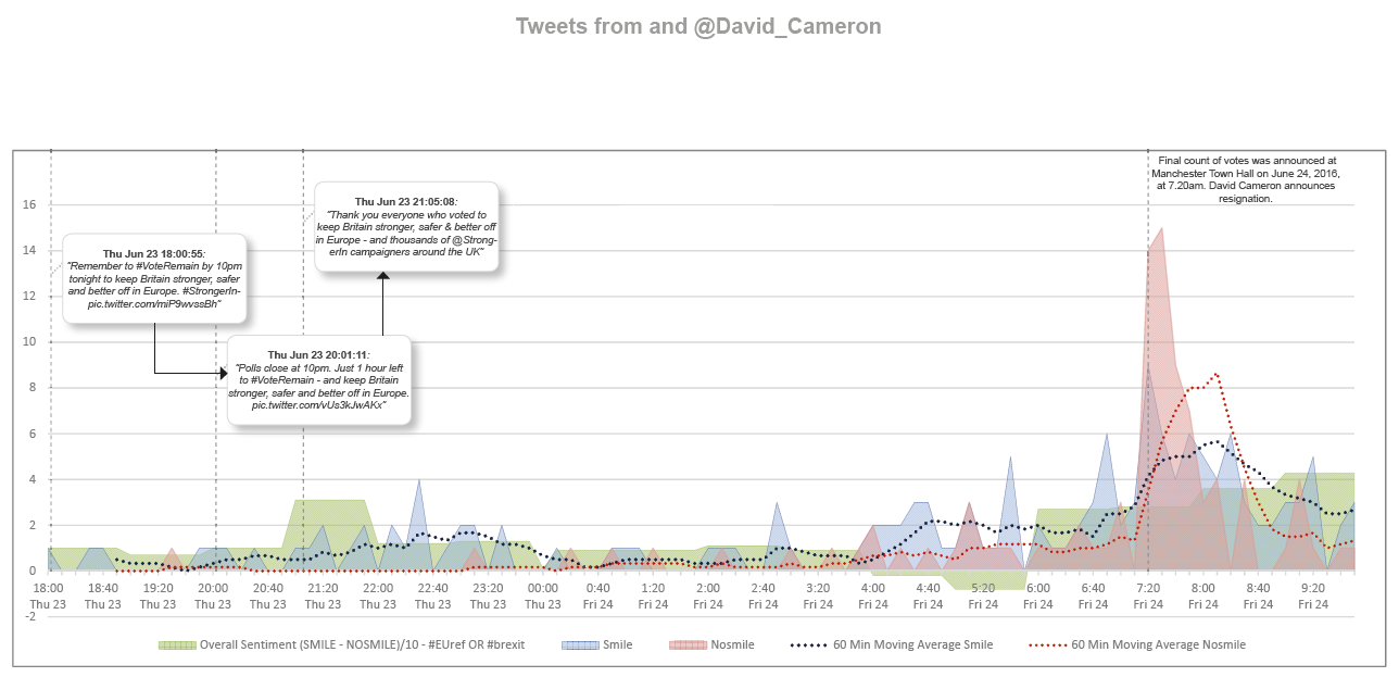
- Smile (blue) and Nosmile (red) was calculated based on all tweets that
are directed @David_Cameron with a clear expression of sentiment.
From 06/23/2016 18:00 to 06/24/2016 9:50, this data encompasses 147
positive tweets and 94 negative tweets (ratio = 1.56).
Tweets from David_Cameron are attached in chronological order to the
chart above.
2a) Tweets from and @Nigel_Farage; Timespan: Thu 21 2016 to Fri 25 2016
- From 06/21/2016 0:00 to 06/25/2016 0:00, for hashtags #EUref or #Brexit, there
were 8512 tweets (of those, 191 Geotweets/ 2.2%) with positive sentiment (smile)
and 4052 tweets (of those, 126 Geotweets/ 3.1%) with negative sentiment (nosmile).
- Smile (blue) and Nosmile (red) was calculated based on all tweets that
are directed @Nigel_Farage with a clear expression of sentiment.
From 06/21/2016 0:00 to 06/25/2016 0:00, this data encompasses 432
positive tweets and 57 negative tweets (ratio = 7.58).
Tweets from Nigel_Farage are attached in chronological order to the
chart above.
2b) Tweets from and @David_Cameron; Timespan: Thu 21 2016 to Fri 25 2016
- Smile (blue) and Nosmile (red) was calculated based on all tweets that are directed @David_Cameron with a clear expression of sentiment. From 06/21/2016 0:00 to 06/25/2016 0:00, this data encompasses 313 positive tweets and 137 negative tweets (ratio = 2.29). Tweets from David_Cameron are attached in chronological order to the chart above.
[ ] Add comparison to overall #Brexit & #EURef tweets (Context)
c) Cherry Blossoming
1) Comparison of Reactions across Flickr / Twitter (AD)
Starting point: Cherry tweets or Flickr tags/titles Query: (Cherry AND (*blossom* OR *flower*)) OR (Sakura AND (*blossom* OR *flower*))
1a) Temporal Facet Twitter:
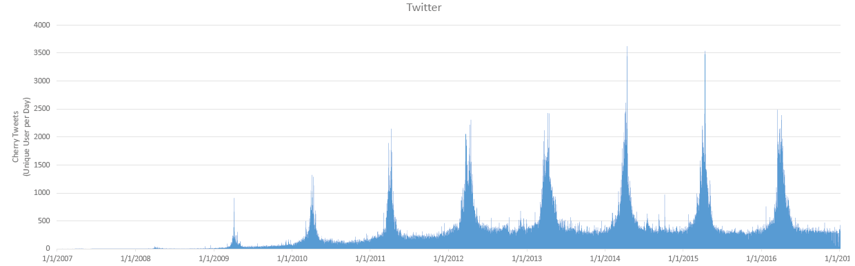
- Overall rise & decline of Twitter network (=context/bias)
- regular, reoccuring pattern; underlying contstant volume of noise
1b) Temporal Facet Twitter & Flickr:
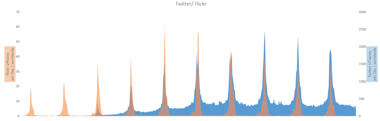
- Overall rise & decline of Twitter (later peak) & Flickr (earlier peak) network (=context/bias)
- regular, reoccuring pattern in both networks; less noise for Flickr geo-data
1c) Spatial Facet Flickr: Worldwide compared to Washington DC Tidal Basin
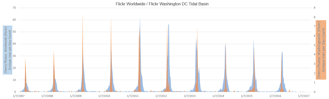
- Filtering for spatial facet will lead to a more clearly delimted event start/end times
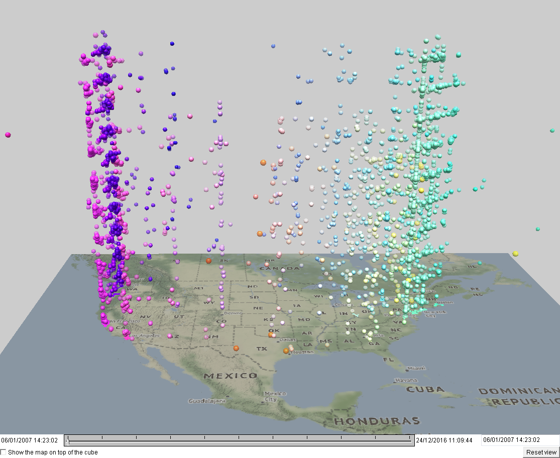
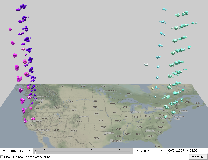
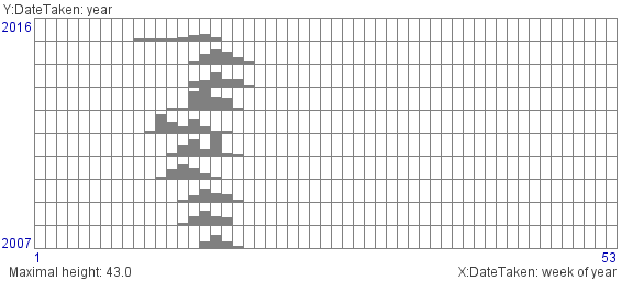
2) Analysis of Flickr Cherry Blossoming Imagery in USA (G&NA)
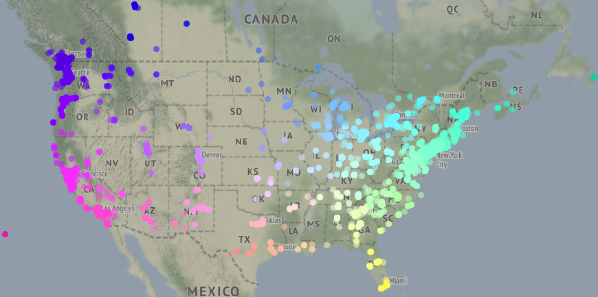
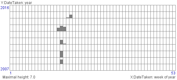
- map_all.png shows a spatial footprint of all photos 2007-2015 (we’ve
excluded photos with dates before 2007; some of them are from 1947)
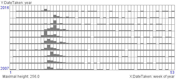
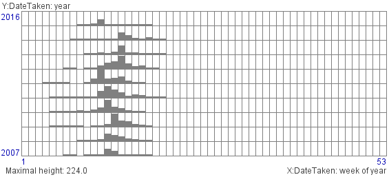
- h2d_all.png: weekly counts of distinct flickr user IDs for weeks and
years
- Next, we’ve applied ST clustering using the method described in
http://dx.doi.org/10.1109/DSAA.2015.7344880
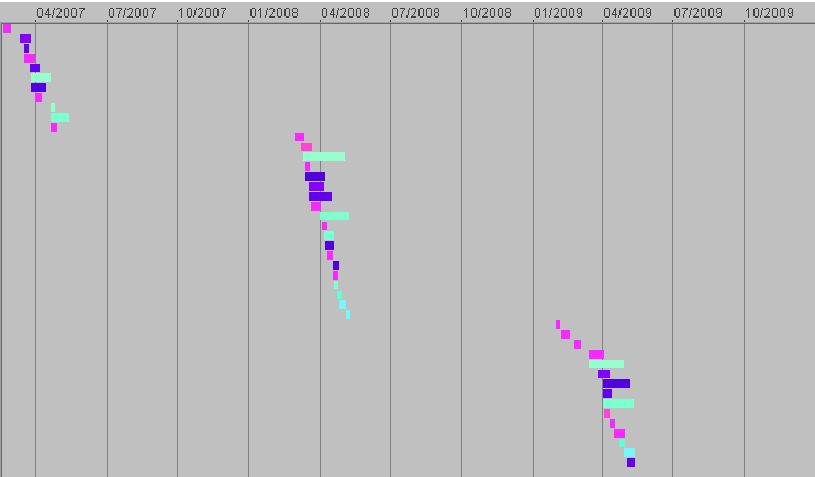
ST clustering:
Timeline ST clusters:
-
2007 - 2009
-
2010 - 2012
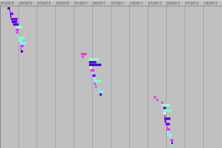
-
2013 - 2015
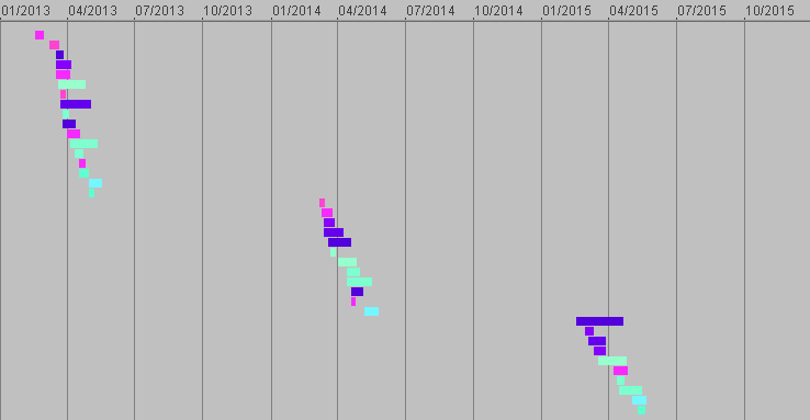
Spatio-temporal clustering (our algorithm) parameters:
mini-cluster radius 100 km
maximal time gap 3 days
merge mini-clusters with at least 5 common events
ignore clusters with <10 events or <5 distinct event rources (UserID)
- Result: 147 ST clusters; sizes from 10 to 7968 (DC)
10 largest clusters with sizes from 1054 to 7968 are in DC
N distinct users: from 5 to 251
10 clusters with more than 100 distinct users are all in DC
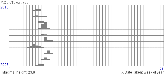
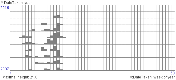
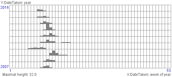
Histograms:
- All:
- Boston:
- DC and Philadelphia:
- Los Angeles:
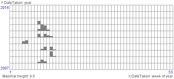
- New Jersey:
- Oregon:
- San Francisco:
- Seattle:
- Toronto:
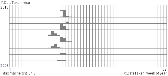
- Vancouver:
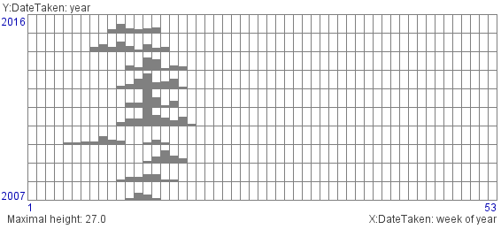
- NE:
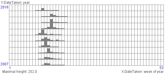
- NW:
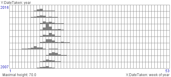
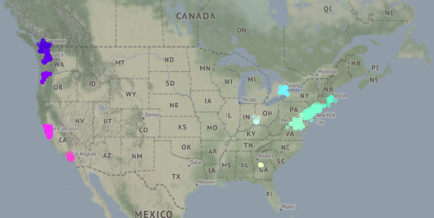
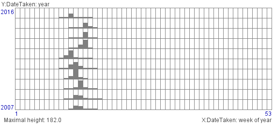
- h2d_ST_clusters:
- After eliminating noise (occasional photos without sufficient number
of neighbors in ST windows), we’ve built 2d histograms (weeks x years) of
weekly counts of distinct flickr user IDs in different parts of the country.